Plotting
update_figure
- isopy.tb.update_figure(figure, *, size=None, width=None, height=None, dpi=None, facecolor=None, edgecolor=None, frameon=None, tight_layout=None, constrained_layout=None)[source]
Update the figure options.
See the matplotlib documentation here for more details on these options.
All isopy plotting functions will automatically send any kwargs prefixed with
figure_to this function.- Parameters
figure (figure, plt) – A matplotlib Figure object or any object with a
.gcf()method that returns a matplotlib Figure object, Such as a matplotlib pyplot instance.size (scalar, (scalar, scalar)) – Either a single value representing both deimensions of a tuple consisting of width and height.
width (scalar) – Width of figure in inches
height (scalar) – Width of figure in inches
dpi (scalar) – Resolution of figure in dots per inch
facecolor (str) – The face colour of figure
edgecolor (str) – The edge colours of figure
frameon (bool) – If
Falsedoes not draw the figure background colourtight_layout (bool) – If
Trueusetight_layoutwhen drawing the figure.constrained_layout (bool) – If
Trueuseconstrained_layoutwhen drawing the figure.
- Returns
figure – Returns the figure
- Return type
Figure
Examples
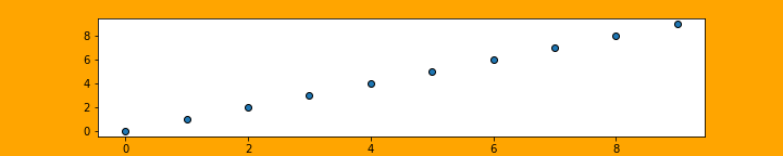
>>> isopy.tb.update_figure(plt, size=(10,2), facecolor='orange')
>>> isopy.tb.plot_scatter(plt, np.arange(10), np.arange(10))
>>> plt.show()

>>> isopy.tb.plot_scatter(plt, np.arange(10), np.arange(10),
                 figure_size=(10, 2), figure_facecolor='orange')
>>> plt.savefig('update_figure2.png')
update_axes
- isopy.tb.update_axes(axes, *, legend=None, **kwargs)[source]
Update axes attributes.
All isopy plotting functions will automatically send any kwargs prefixed with
axes_to this function.- Parameters
axes (axes, dict[str, axes]) – A matplotlib axes or a a dictionary of matplotlib axes. In the latter case the options are applied to each axes in the dictionary.
legend (bool) – If
Truethe legend will be shown on the axes. IfFalseno legend is shown.kwargs – Any attribute that can be set using
axes.set_<key>(value). If the value is a tupleaxes.set_<key>(*value)is used. If the value is a dictionaryaxes.set_<key>(**value).
Examples
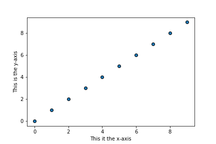
>>> isopy.tb.update_axes(plt, xlabel='This it the x-axis', ylabel='This is the y-axis')
>>> isopy.tb.plot_scatter(plt, np.arange(10), np.arange(10))
>>> plt.show()

>>> isopy.tb.plot_scatter(plt, np.arange(10), np.arange(10),
                        axes_xlabel='This it the x-axis',
                        axes_ylabel='This is the y-axis')
>>> plt.show()
create_subplots
- isopy.tb.create_subplots(figure, subplots, grid=None, *, row_height=None, column_width=None, legend=None, legend_ratio=None, constrained_layout=True, height_ratios=None, width_ratios=None, **kwargs)[source]
Create subplots for a figure.
Use None instead of a name to create an empty space.
- Parameters
figure (figure, plt) – A matplotlib Figure object or any object with a
.gcf()method that returns a matplotlib Figure object, Such as a matplotlib pyplot instance.subplots (list, int) – A nested list of subplot names. A visual layout of how you want your subplots to be arranged labeled as strings. subplots can be a 1-dimensional list if grid is specified.
Nonewill create an empty space. An integer of the number of subplots can be given if grid is specified. Each axes will be namesax<i>e.g.[["ax0", "ax1"], ["ax2", "ax3"]]. A tuple can be passed for twinned axes as (name, [name_twinx], [name_twiny]).grid (tuple[int, int]) – If supplied then subplots will be arranged into grid with this shape. One dimension can be -1 and it wil be calculated based on the size of subplots and the other given dimension. Required that subplots is a one dimensional sequence.
row_height – The height of each row in final figure. If height_ratios is given then the height of each row is row_height multiplied by the height ratio.
row_height – The width of each column in final figure. If width_ratios is given then the width of each column is column_width multiplied by the width ratio.
legend ({"n", "e", "s", "w"}, None) – Creates an additional row/column for the legend at the position indicated. This subplot is given the name “legend” in the output.
legend_ratio – The relative size of the legend. If height_ratios or width_ratios has not been given then the value for other each row/column is assumed to be 1.
constrained_layout (bool) – If
Trueuseconstrained_layoutwhen drawing the figure. Advised to avoid overlapping axis labels.height_ratios – A list of the relative height for each row.
width_ratios – A list of the relative width of each column.
kwargs –
Prefix kwargs to be passed along witht he creation of each subplot with
subplot_. Kwargs to be passed to the GridSpec should be prefixedgridspec_. See matplotlib docs for add_subplotand Gridspec
for a list of avaliable kwargs.
- Returns
subplots – A dictionary containing the newly created subplots.
- Return type
Examples
>>> subplots = [['one', 'two', 'three', 'four']]
>>> axes = isopy.tb.create_subplots(plt, subplots)
>>> for name, ax in axes.items(): ax.set_title(name)
>>> plt.show()

>>> subplots = ['one', 'two', 'three', 'four', 'five', 'six']
>>> axes = isopy.tb.create_subplots(plt, subplots, (-1, 2))
>>> for name, ax in axes.items(): ax.set_title(name)
>>> plt.show()

>>> subplots = [['one', 'two'], ['three', 'two'], ['four', 'four']]
>>> axes = isopy.tb.create_subplots(plt, subplots)
>>> for name, ax in axes.items(): ax.set_title(name)
>>> plt.show()

Presets
The following presets are avaliable for this function:
create_subplots.v(*args, **kwargs, grid = (-1, 1))create_subplots.h(*args, **kwargs, grid = (1, -1))
create_legend
- isopy.tb.create_legend(axes, *include_axes, labels=None, hide_axis=None, errorbars=True, newlines=None, **kwargs)[source]
Create a legend encompassing multiple axes.
Items in axes, if there are any, will be included in the legend.
If mutilple axes contains items with the same label then only the item from the last axes is included in the legend. Empty labels or labels beggining with
'_'are not included in the legend.- Parameters
axes – The axes on which the legend will be drawn. any items in this axes will be included in the legend.
include_axes – Items from axes given here will be included in the legend. Accepts a dict containing axes.
labels – If given then only items with this label will be included in the legend.
hide_axis – If
Truethen the x and y axis of axes will be hidden. IfNonethen the axis is hidden only if include_axes are given and there are not items axes with a label.errorbars – If
Falsethen the errobars wont appear on the markers in the legend.newlines – A dictionary of new lines to be created and included in the legend. The key corresponds to the label and the value is another dict of the kwargs for a line.
kwargs – Any additional kwargs to be passed when creating the legend. See legend for a list of avaliable kwargs.
Examples
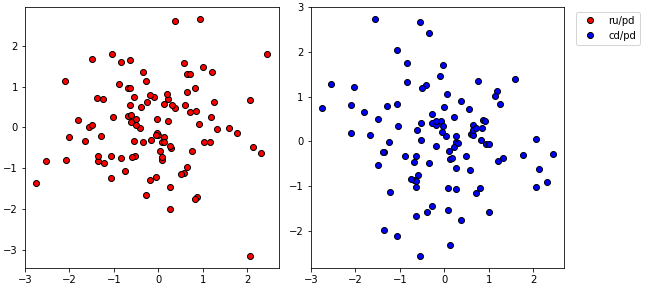
>>> data = isopy.random(100, keys='ru pd cd'.split())
>>> axes = isopy.tb.create_subplots(plt, [['left', 'right']], figure_width=8)
>>> isopy.tb.plot_scatter(axes['left'], data['pd'], data['ru'], label='ru/pd', color='red')
>>> isopy.tb.plot_scatter(axes['right'], data['pd'], data['cd'], label='cd/pd', color='blue')
>>> isopy.tb.create_legend(axes['right'], axes['left'])
>>> plt.show()

>>> data = isopy.random(100, keys='ru pd cd'.split())
>>> axes = isopy.tb.create_subplots(plt, [['left', 'right', 'legend']],
                                    figure_width=9, gridspec_width_ratios=[4, 4, 1])
>>> isopy.tb.plot_scatter(axes['left'], data['pd'], data['ru'], label='ru/pd', color='red')
>>> isopy.tb.plot_scatter(axes['right'], data['pd'], data['cd'], label='cd/pd', color='blue')
>>> isopy.tb.create_legend(axes['legend'], axes, hide_axis=True)
>>> plt.show()
plot_scatter
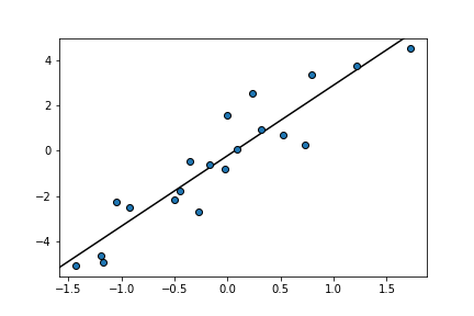
- isopy.tb.plot_scatter(axes, x, y, xerr=None, yerr=None, color=None, marker=True, line=False, regression=None, **kwargs)[source]
Plot data points with error bars on axes.
- Parameters
axes (axes, plt) – The axes on which the data points will we plotted. Must be a matplotlib axes object or any object with a gca() method that return a matplotlib axes object, such as a matplotlib pyplot instance.
x (numpy_array_like) – Any object that can be converted to a numpy array. Multidimensional array will be flattened. x and y must be the same size.
y (numpy_array_like) – Any object that can be converted to a numpy array. Multidimensional array will be flattened. x and y must be the same size.
xerr (scalar, numpy_array_like) – Uncertainties associated with x and y values. Can be any object that can be converted to a numpy array. Multidimensional array will be flattened. Must either have the same size as x and y or be a single value which will be used for all datapoints. If
Noneno errorbars are shown.yerr (scalar, numpy_array_like) – Uncertainties associated with x and y values. Can be any object that can be converted to a numpy array. Multidimensional array will be flattened. Must either have the same size as x and y or be a single value which will be used for all datapoints. If
Noneno errorbars are shown.color (str, Optional) –
Color of the marker face and line between points, if marker and line are not
False. Accepted strings are named colour in matplotlib or a string of a hex triplet begining with “#”. See here for a list of named colours in matplotlib. If not given the next colour on the internal matplotlib colour cycle is used.marker (bool, str, Default = True) –
If
Truea marker is shown for each data point. IfFalseno marker is shown. Can also be a string describing any marker accepted by matplotlib. See here for a list of avaliable markers.line (bool, str, Default = False) –
If
Truea line is drawn between each datapoint. IfFalseno line is shown. Can also be a string describing a linestyle defined by matplotlib. See here for a list of avaliable linestyles.Truedefaults to"solid".regression ({'york1', 'york2', 'linear'}, Optional) – A string with the name of a regression to be applied to the data and then plotted. Valid options are york1, york2, and linear.
kwargs –
Any keyword argument accepted by matplotlib axes method errorbar. See here for a list of keyword arguments.
Examples
>>> x = isopy.random(20, seed=46)
>>> y = x * 3 + isopy.random(20, seed=47)
>>> isopy.tb.plot_scatter(plt, x, y)
>>> plt.show()

>>> x = isopy.random(20, seed=46)
>>> y = x * 3 + isopy.random(20, seed=47)
>>> xerr = 0.2
>>> yerr = isopy.random(20, seed=48)
>>> isopy.tb.plot_scatter(plt, x, y, xerr, yerr, regression='york1', color='red', marker='s')
>>> plt.show()

plot_regression
- isopy.tb.plot_regression(axes, regression_result, color=None, line=True, xlim=None, autoscale=False, fill=True, edgeline=True, label_equation=True, **kwargs)[source]
Plot the result of a regression on matplotlib axes.
If regression_result has a
y_se(x)method the error envelope of the regression will also be plotted.- Parameters
axes (axes, plt) – If y is a numpy array axes must be a matplotlib axes object or object with a gca() method that return a matplotlib axes object, such as a matplotlib pyplot instance. If y is an isopy array axes must be a matplotlib Figure or any object with a
.gcf()method that returns a matplotlib Figure object, Such as a matplotlib pyplot instance.regression_result – Any object returned by one of isopy’s regression functions, an object with
.slopeand.interceptattributes or a callable object which takes the x value and returns the y value. Can also be either a single scalar representing the slope or a tuple of two scalars, representing the slope and the intercept.color (str, Optional) –
Color of the regression line if line is not
False. Accepted strings are named colour in matplotlib or a string of a hex triplet begining with “#”. See here for a list of named colours in matplotlib. If not given the next colour on the internal matplotlib colour cycle is used.line (bool, str, Default = True) –
If
Truea the regression line is drawn within xlim. IfFalseno line is shown. Can also be a string describing a linestyle defined by matplotlib. See here for a list of avaliable linestyles.Truedefaults to"solid".xlim (tuple[int, int]) – A tuple of the lower and upper x value for which to plot the regression line. If
Nonethe current xlim of the axes is used.autoscale (bool, Default = False) – If
Falsethe regression will not be taken into account when figure is rescaled. This if not officially supported by matplotlib and thus might not always work.fill (bool, Default = True) – If
Truethe error enveloped is filled in with color. IfFalsethe error envelope is not filled in.edgeline (bool, Default = True) –
If
Truethe edges of the error envelope are drawn as a line. IfFalseno line is shown. Can also be a string describing a linestyle defined by matplotlib. See here for a list of avaliable linestyles.Truedefaults to"dashed".label_equation (bool) – If
Truethe equation of the regression line will be added to the label of the regression line.kwargs –
Any keyword argument accepted by matplotlib axes methods. By default kwargs are attributed to the regression line. Prefix kwargs for the fill area with
fill_and kwargs for the edge lines withedgeline_. See here for a list of keyword arguments for the regression line and edge lines. See here for a list of keyword arguments for the fill area.
Examples
>>> x = isopy.random(20, seed=46)
>>> y = x * 3 + isopy.random(20, seed=47)
>>> regression = isopy.tb.regression_linear(x, y)
>>> isopy.tb.plot_scatter(plt, x, y)
>>> isopy.tb.plot_regression(plt, regression)
>>> plt.show()
>>> x = isopy.random(20, seed=46)
>>> y = x * 3 + isopy.random(20, seed=47)
>>> regression = lambda x: 2 * x + x ** 2 #Any callable that takes x and return y is a valid
>>> isopy.tb.plot_scatter(plt, x, y, color='red')
>>> isopy.tb.plot_regression(plt, regression, color='red', xlim=(-1, 1))
>>> plt.show()

>>> x = isopy.random(20, seed=46)
>>> y = x * 3 + isopy.random(20, seed=47)
>>> xerr = 0.2
>>> yerr = isopy.random(20, seed=48)
>>> regression = isopy.tb.regression_york1(x, y, xerr, yerr)
>>> isopy.tb.plot_scatter(plt, x, y, xerr, yerr)
>>> isopy.tb.plot_regression(plt, regression)
>>> plt.show()

>>> x = isopy.random(20, seed=46)
>>> y = x * 3 + isopy.random(20, seed=47)
>>> xerr = 0.2
>>> yerr = isopy.random(20, seed=48)
>>> isopy.tb.plot_scatter(plt, x, y, xerr, yerr, color='red')
>>> isopy.tb.plot_regression(plt, regression, color='red', line='dashed', edgeline=False)
>>> plt.show()

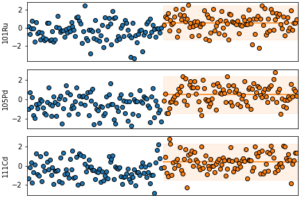
plot_vstack
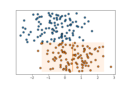
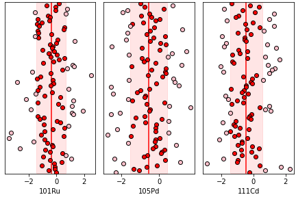
- isopy.tb.plot_vstack(axes, x, xerr=None, ystart=None, *, outliers=None, cval=None, pmval=None, color=None, marker=True, line=False, cline=True, pmline=False, box=True, pad=2, box_pad=None, spacing=-1, hide_yaxis=True, compare=False, subplots_grid=(1, -1), **kwargs)[source]
Plot values along the x-axis at a regular y interval. Also known as Caltech or Carnegie plot.
Can also take an array in which case it will create a grid of subplots, one for each column in the array.
- Parameters
axes (axes, figure, plt) – If x is a numpy array axes must be a matplotlib axes object or object with a gca() method that return a matplotlib axes object, such as a matplotlib pyplot instance. If x is an isopy array axes must be a matplotlib Figure or any object with a
.gcf()method that returns a matplotlib Figure object, Such as a matplotlib pyplot instance.x (numpy_array_like, isopy_array) – Any object that can be converted to a numpy array. Multidimensional array will be flattened. ‘x* and y must be the same size.
xerr (numpy_array_like, isopy_array, Optional) – Uncertianties associated with y values. Must be an object that can be converted to a numpy array. Multidimensional array will be flattened. Must either be an array with the same size as y or a single value which will be used for all values of y. If
Noneno errorbars are shown.ystart (scalar, Optional) – The starting valeu on the yaxis. If
Noneit is inferred from values already plotted on the axes. If x is an isopy array the ystart will be the same for all subplots.outliers (bool, Optional) – A boolean array same size as x where
Truemeans a data point is considered an outlier.cval (scalar, Callable, Optional) – The center value of the data. Can either be a scalar or a function that returns a scalar when called with x. If cval is a function is it called on the values that are not outliers. If cval is
Truenp.meanis used to calculate cval.pmval (scalar, Callable, Optional) – The uncertainty of the the data. Can either be a scalar or a function that returns a scalar when called with x. If pmval is a function is it called on the values that are not outliers. If pmval is
Trueisopt.sd2is used to calculate pmval.color (str, Optional) –
Color of the marker face and line between points, if marker and line are not
False. Accepted strings are named colour in matplotlib or a string of a hex triplet begining with “#”. See here for a list of named colours in matplotlib. If not given the next colour on the internal matplotlib colour cycle is used.marker (bool, str, Default = True) –
If
Truea marker is shown for each data point. If`Falseno marker is shown. Can also be a string describing any marker accepted by matplotlib. See here for a list of avaliable markers.line (bool, str, Default = False) –
If
Truea line is drawn between each datapoint. IfFalseno line is shown. Can also be a string describing a linestyle defined by matplotlib. See here for a list of avaliable linestyles.Truedefaults to"solid".cline (bool, str, Default = True) –
If
Truea center line is drawn at cval alongside the data points. IfFalseno line is shown. Can also be a string describing a linestyle defined by matplotlib. See here for a list of avaliable linestyles.Truedefaults to"solid". Only shown if cval is given.pmline (bool, str, Default = False) –
If
Truetwo lines at the upper uncertainty (cval+pmval) and lower uncertainty (cval-pmval) alongside the data points, . IfFalseno line is shown. Can also be a string describing a linestyle defined by matplotlib. See here for a list of avaliable linestyles.Truedefaults to"solid". Only shown if cval and pmval are given.box (bool, Default = True) – If
Truea semitransparent box is drawn alongisde the data points basedon the cval and pmval values.pad (scalar, Default = 2) – The space between previous data points and the new data points on the y-axis.
box_pad (scalar, Optional) – The space the cline, pmline and box extends past the data points on the y-axis. If
Nonea 1/4 of pad is used.spacing (scalar, Default = 1) – The space between data points on the y-axis.
hide_yaxis (bool, Default = True) – Hides the y-axis ticks and label.
compare (bool) – If
Trueaxes is passed toplot_vcompareat the end of the function.subplots_grid (tuple[int, int]) – The shape of the grid to be created if nessecary.
kwargs –
Any keyword argument accepted by matplotlib axes methods. By default kwargs are attributed to the data points. Prefix kwargs for the center line with
cline_, kwargs for the plus/minus lines withpmline_and kwargs for the box area withbox_. See here for a list of keyword arguments for the data points. See here for a list of keyword arguments for the center and plus/minus lines. See here for a list of keyword arguments for the box area.
Examples
>>> array1 = isopy.random(100, -0.5, seed=46)
>>> array2 = isopy.random(100, 0.5, seed=47)
>>> isopy.tb.plot_vstack(plt, array1)
>>> isopy.tb.plot_vstack(plt, array2, cval=np.mean, pmval=isopy.sd2)
>>> plt.show()
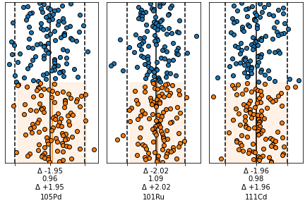
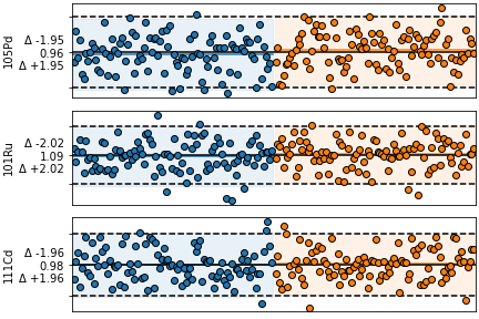
>>> keys = isopy.keylist('pd105', 'ru101', 'cd111')
>>> array1 = isopy.random(100, -0.5, keys, seed=46)
>>> array2 = isopy.random(100, 0.5, keys, seed=47)
>>> isopy.tb.create_subplots(plt, keys.sorted(), (1, -1))
>>> isopy.tb.plot_vstack(plt, array1)
>>> isopy.tb.plot_vstack(plt, array2, cval=np.mean, pmval=isopy.sd2)
>>> plt.show()

>>> keys = isopy.keylist('pd105', 'ru101', 'cd111')
>>> array = isopy.random(100, -0.5, keys, seed=46)
>>> mean = np.mean(array);
>>> sd = isopy.sd(array)
>>> outliers = isopy.tb.find_outliers(array, mean, sd)
>>> isopy.tb.create_subplots(plt, keys.sorted(), (1, -1))
>>> isopy.tb.plot_vstack(plt, array, cval=mean, pmval=sd, outliers=outliers, color=('red', 'pink'))
>>> plt.show()
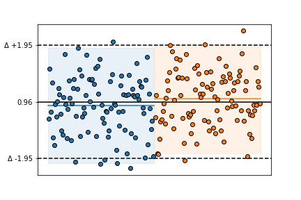
plot_vcompare
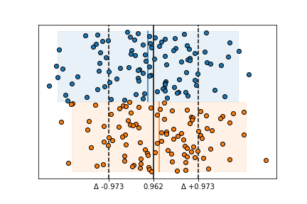
- isopy.tb.plot_vcompare(axes, cval=<function nanmean>, pmval=functools.partial(<function nansd>, zscore=2), sigfig=2, pmunit='diff', cline='-', pmline='--', color='black', axis_color=None, ignore_outliers=True, combine_ticklabels=5)[source]
A comparison plot for data sets on a vstack.
Calculate the center and uncertainty values for all data plotted on a vstack and set the x axis tick marks at
[cval-pmval, cval, cval+pmval]and format the tick labels according to pmunit.- Parameters
axes (axes, figure, plt) – Either a matplotlib axes object or a matplotlib Figure object. Objects with a gca() method that return a matplotlib axes object, such as a matplotlib pyplot instance are also accepted. If axes is a matplotlib Figure object then
plot_vcompare()will be called on every named subplot in the figure.cval (scalar, Callable, Optional) – Either a scalar representing the center value or a function that will be used to calculate the center value based on all the x-axis data points in axes.
pmval (scalar, Callable, Optional) – Either a scalar representing the uncertainty on the center value or a function that will be used to calculate the uncertainty based on all the x-axis data points in axes.
sigfig (int, Default = 2) – The number of significant figures to be shown on the x-axis tick labels.
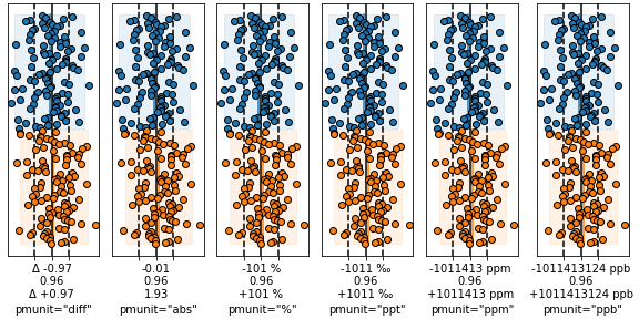
pmunit (str, Default = 'diff') –
Defines the unit of the tick labels for the pmline’s. Avaliable options are:
"diff"- The tick labels are shown asf'"Δ {+pmval}"andf'"Δ {-pmval}"."abs"- The tick labels are shown asf'"{cval+pmval}"andf'"{cval-pmval}"."percent"or"%"- The tick labels are shown asf'"{+pmval/cval*100} %"andf'"{-pmval/cval*100} %"."permil"or"ppt"- The tick labels are shown asf'"{+pmval/cval*1000} ‰"andf'"{-pmval/cval*1000} ‰"."ppm"- The tick labels are shown asf'"{+pmval/cval*1E6} ppm"andf'"{-pmval/cval*1E6} ppm"."ppb"- The tick labels are shown asf'"{+pmval/cval*1E9} ppb"andf'"{-pmval/cval*1E9} ppb".
A tuple can be used to set different units for the upper and lower tick labels.
cline (bool, str, Default = True) –
If
Truea vertical line is drawn along cval. IfFalseno line is shown. Can also be a string describing a linestyle defined by matplotlib. See here for a list of avaliable linestyles.Truedefaults to"solid".pmline (bool, str, Default = True) –
- If
Truevertical lines are drawn alongcval-pmval` and ``cval+pmval. If
Falseno line is shown. Can also
be a string describing a linestyle defined by matplotlib. See here for a list of avaliable linestyles.
Truedefaults to"dashed".- If
color (str, Optional) –
Color cline and pmline lines. Accepted strings are named colour in matplotlib or a string of a hex triplet begining with “#”. See here for a list of named colours in matplotlib. If
Nonethe default value isblack.axis_color (bool, str, Optional) – If
Truethe elements on the x-axis are given the same colour as color.ignore_outliers (bool, Default = True) – If
Trueoutliers are not used to calculate cval and pmline.combine_ticklabels (bool, scalar, Default = 5) – If
Truethe all three tick labels are combined into the center tick label. This is useful if there isnt enough space to display them all next to each other. If combinde_ticklabels is a scalar then the tick labels are only combined if the difference between the limits and the plus/minus tick label positions exceed this value.
Examples
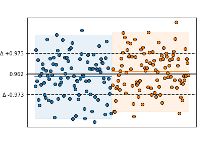
>>> array1 = isopy.random(100, -0.5, seed=46)
>>> array2 = isopy.random(100, 0.5, seed=47)
>>> isopy.tb.plot_vstack(plt, array1, cval=np.mean, pmval=isopy.sd2)
>>> isopy.tb.plot_vstack(plt, array2, cval=np.mean, pmval=isopy.sd2)
>>> isopy.tb.plot_vcompare(plt)
>>> plt.show()

>>> array1 = isopy.random(100, -0.5, seed=46)
>>> array2 = isopy.random(100, 0.5, seed=47)
>>> isopy.tb.plot_vstack(plt, array1, cval=np.mean, pmval=isopy.sd2)
>>> isopy.tb.plot_vstack(plt, array2, cval=np.mean, pmval=isopy.sd2)
>>> isopy.tb.plot_vcompare(plt, pmval=isopy.sd, sigfig=3)
>>> plt.show()
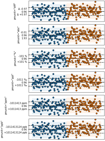
>>> pmunits = ['diff', 'abs', '%', 'ppt', 'ppm', 'ppb']
>>> subplots = isopy.tb.create_subplots(plt, pmunits, (1, -1), figure_width=8)
>>> array1 = isopy.random(100, 0.9, seed=46)
>>> array2 = isopy.random(100, 1.1, seed=47)
>>> for unit, axes in subplots.items():
        isopy.tb.plot_vstack(axes, array1, cval=np.mean, pmval=isopy.sd2)
        isopy.tb.plot_vstack(axes, array2, cval=np.mean, pmval=isopy.sd2)
        isopy.tb.plot_vcompare(axes, pmval=isopy.sd, pmunit=unit, combine_ticklabels=True)
        axes.set_xlabel(f'pmunit="{unit}"')
>>> plt.show()
>>> keys = isopy.keylist('pd105', 'ru101', 'cd111')
>>> array1 = isopy.random(100, 0.9, keys, seed=46)
>>> array2 = isopy.random(100, 1.1, keys, seed=47)
>>> isopy.tb.plot_vstack(plt, array1)
>>> isopy.tb.plot_vstack(plt, array2, cval=np.mean, pmval=isopy.sd2)
>>> isopy.tb.plot_vcompare(plt.gcf(), combine_ticklabels=True)
>>> plt.show()
plot_hstack
- isopy.tb.plot_hstack(axes, y, yerr=None, xstart=None, *, outliers=None, cval=None, pmval=None, color=None, marker=True, line=False, cline=True, pmline=False, box=True, pad=2, box_pad=None, spacing=1, hide_xaxis=True, compare=False, subplots_grid=(-1, 1), **kwargs)[source]
Plot values along the x-axis at a regular y interval. Also known as Caltech or Carnegie plot.
Can also take an array in which case it will create a grid of subplots, one for each column in the array.
- Parameters
axes (axes, figure, plt) – If y is a numpy array axes must be a matplotlib axes object or object with a gca() method that return a matplotlib axes object, such as a matplotlib pyplot instance. If y is an isopy array axes must be a matplotlib Figure or any object with a
.gcf()method that returns a matplotlib Figure object, Such as a matplotlib pyplot instance.y (numpy_array_like, isopy_array) – Any object that can be converted to a numpy array. Multidimensional array will be flattened. x and y must be the same size.
yerr (numpy_array_like, isopy_array, Optional) – Uncertianties associated with y values. Must be an object that can be converted to a numpy array. Multidimensional array will be flattened. Must either be an array with the same size as y or a single value which will be used for all values of y. If
Noneno errorbars are shown.xstart (scalar, Optional) – The starting value on the yaxis. If
Noneit is inferred from values already plotted on the axes. If y is an isopy array the xstart will be the same for all subplots.outliers (bool, Optional) – A boolean array same size as y where
Truemeans a data point is considered an outlier.cval (scalar, Callable, Optional) – The center value of the data. Can either be a scalar or a function that returns a scalar when called with x. If cval is a function is it called on the values that are not outliers. If cval is
Truenp.meanis used to calculate cval.pmval (scalar, Callable, Optional) – The uncertainty of the the data. Can either be a scalar or a function that returns a scalar when called with x. If pmval is a function is it called on the values that are not outliers. If pmval is
Trueisopt.sd2is used to calculate pmval.color (str, Optional) –
Color of the marker face and line between points, if marker and line are not
False. Accepted strings are named colour in matplotlib or a string of a hex triplet begining with “#”. See here for a list of named colours in matplotlib. If not given the next colour on the internal matplotlib colour cycle is used.marker (bool, str, Default = True) –
If
Truea marker is shown for each data point. If`Falseno marker is shown. Can also be a string describing any marker accepted by matplotlib. See here for a list of avaliable markers.line (bool, str, Default = False) –
If
Truea line is drawn between each datapoint. IfFalseno line is shown. Can also be a string describing a linestyle defined by matplotlib. See here for a list of avaliable linestyles.Truedefaults to"solid".cline (bool, str, Default = True) –
If
Truea center line is drawn at cval alongside the data points. IfFalseno line is shown. Can also be a string describing a linestyle defined by matplotlib. See here for a list of avaliable linestyles.Truedefaults to"solid". Only shown if cval is given.pmline (bool, str, Default = False) –
If
Truetwo lines at the upper uncertainty (cval+pmval) and lower uncertainty (cval-pmval) alongside the data points, . IfFalseno line is shown. Can also be a string describing a linestyle defined by matplotlib. See here for a list of avaliable linestyles.Truedefaults to"solid". Only shown if cval and pmval are given.box (bool, Default = True) – If
Truea semitransparent box is drawn alongisde the data points basedon the cval and pmval values.pad (scalar, Default = 2) – The space between previous data points and the new data points on the x-axis.
box_pad (scalar, Optional) – The space the cline, pmline and box extends past the data points on the x-axis. If
Nonea 1/4 of pad is used.spacing (scalar, Default = 1) – The space between data points on the x-axis.
hide_yaxis (bool, Default = True) – Hides the x-axis ticks and label.
compare (bool) – If
Trueaxes is passed toplot_vcompareat the end of the function.subplots_grid (tuple[int, int]) – The shape of the grid to be created if nessecary.
kwargs –
Any keyword argument accepted by matplotlib axes methods. By default kwargs are attributed to the data points. Prefix kwargs for the center line with
cline_, kwargs for the plus/minus lines withpmline_and kwargs for the box area withbox_. See here for a list of keyword arguments for the data points. See here for a list of keyword arguments for the center and plus/minus lines. See here for a list of keyword arguments for the box area.
Examples
>>> array1 = isopy.random(100, -0.5, seed=46)
>>> array2 = isopy.random(100, 0.5, seed=47)
>>> isopy.tb.plot_hstack(plt, array1)
>>> isopy.tb.plot_hstack(plt, array2, cval=np.mean, pmval=isopy.sd2)
>>> plt.show()

>>> keys = isopy.keylist('pd105', 'ru101', 'cd111')
>>> array1 = isopy.random(100, -0.5, keys, seed=46)
>>> array2 = isopy.random(100, 0.5, keys, seed=47)
>>> isopy.tb.create_subplots(plt, keys.sorted(), (-1, 1))
>>> isopy.tb.plot_hstack(plt, array1)
>>> isopy.tb.plot_hstack(plt, array2, cval=np.mean, pmval=isopy.sd2)
>>> plt.show()
>>> keys = isopy.keylist('pd105', 'ru101', 'cd111')
>>> array = isopy.random(100, -0.5, keys, seed=46)
>>> mean = np.mean(array);
>>> sd = isopy.sd(array)
>>> outliers = isopy.tb.find_outliers(array, mean, sd)
>>> isopy.tb.create_subplots(plt, keys.sorted(), (-1, 1))
>>> isopy.tb.plot_hstack(plt, array, cval=mean, pmval=sd, outliers=outliers, color=('red', 'pink'))
>>> plt.show()

plot_hcompare
- isopy.tb.plot_hcompare(axes, cval=<function nanmean>, pmval=functools.partial(<function nansd>, zscore=2), sigfig=2, pmunit='diff', cline=True, pmline=True, color='black', axis_color=None, ignore_outliers=True, combine_ticklabels=5)[source]
A comparison plot for data sets on a hstack.
Calculate the center and uncertainty values for all data plotted on a hstack and set the y axis tick marks at
[cval-pmval, cval, cval+pmval]and format the tick labels according to pmunit.- Parameters
axes (axes, figure, plt) – Either a matplotlib axes object or a matplotlib Figure object. Objects with a gca() method that return a matplotlib axes object, such as a matplotlib pyplot instance are also accepted. If axes is a matplotlib Figure object then
plot_hcompare()will be called on every named subplot in the figure.cval (scalar, Callable, Optional) – Either a scalar representing the center value or a function that will be used to calculate the center value based on all the y-axis data points in axes.
pmval (scalar, Callable, Optional) – Either a scalar representing the uncertainty on the center value or a function that will be used to calculate the uncertainty based on all the y-axis data points in axes.
sigfig (int, Default = 2) – The number of significant figures to be shown on the y-axis tick labels.
pmunit (str, Default = 'diff') –
Defines the unit of the tick labels for the pmline’s. Avaliable options are:
"diff"- The tick labels are shown asf'"Δ {+pmval}"andf'"Δ {-pmval}"."abs"- The tick labels are shown asf'"{cval+pmval}"andf'"{cval-pmval}"."percent"or"%"- The tick labels are shown asf'"{+pmval/cval*100} %"andf'"{-pmval/cval*100} %"."permil"or"ppt"- The tick labels are shown asf'"{+pmval/cval*1000} ‰"andf'"{-pmval/cval*1000} ‰"."ppm"- The tick labels are shown asf'"{+pmval/cval*1E6} ppm"andf'"{-pmval/cval*1E6} ppm"."ppb"- The tick labels are shown asf'"{+pmval/cval*1E9} ppb"andf'"{-pmval/cval*1E9} ppb".
A tuple can be used to set different units for the upper and lower tick labels.
cline (bool, str, Default = True) –
If
Truea horizontal line is drawn along cval. IfFalseno line is shown. Can also be a string describing a linestyle defined by matplotlib. See here for a list of avaliable linestyles.Truedefaults to"solid".pmline (bool, str, Default = True) –
- If
Truehorizontal lines are drawn alongcval-pmval` and ``cval+pmval. If
Falseno line is shown. Can also
be a string describing a linestyle defined by matplotlib. See here for a list of avaliable linestyles.
Truedefaults to"dashed".- If
color (str, Optional) –
Color cline and pmline lines. Accepted strings are named colour in matplotlib or a string of a hex triplet begining with “#”. See here for a list of named colours in matplotlib. If
Nonethe default value isblack.axis_color (bool, str, Optional) – If
Truethe elements on the y-axis are given the same colour as color.ignore_outliers (bool, Default = True) – If
Trueoutliers are not used to calculate cval and pmline.combine_ticklabels (bool, scalar, Default = 5) – If
Truethe all three tick labels are combined into the center tick label. This is useful if there isnt enough space to display them all next to each other. If combinde_ticklabels is a scalar then the tick labels are only combined if the difference between the limits and the plus/minus tick label positions exceed this value.
Examples
>>> array1 = isopy.random(100, 0.9, seed=46)
>>> array2 = isopy.random(100, 1.1, seed=47)
>>> isopy.tb.plot_hstack(plt, array1, cval=np.mean, pmval=isopy.sd2)
>>> isopy.tb.plot_hstack(plt, array2, cval=np.mean, pmval=isopy.sd2)
>>> isopy.tb.plot_hcompare(plt)
>>> plt.show()
>>> array1 = isopy.random(100, 0.9, seed=46)
>>> array2 = isopy.random(100, 1.1, seed=47)
>>> isopy.tb.plot_hstack(plt, array1, cval=np.mean, pmval=isopy.sd2)
>>> isopy.tb.plot_hstack(plt, array2, cval=np.mean, pmval=isopy.sd2)
>>> isopy.tb.plot_hcompare(plt, pmval=isopy.sd, sigfig=3)
>>> plt.show()
>>> pmunits = ['diff', 'abs', '%', 'ppt', 'ppm', 'ppb']
>>> subplots = isopy.tb.create_subplots(plt, pmunits, (-1, 1), figure_height=8)
>>> array1 = isopy.random(100, 0.9, seed=46)
>>> array2 = isopy.random(100, 1.1, seed=47)
>>> for unit, axes in subplots.items():
        isopy.tb.plot_hstack(axes, array1, cval=np.mean, pmval=isopy.sd2)
        isopy.tb.plot_hstack(axes, array2, cval=np.mean, pmval=isopy.sd2)
        isopy.tb.plot_hcompare(axes, pmval=isopy.sd, pmunit=unit, combine_ticklabels=True)
        axes.set_ylabel(f'pmunit="{unit}"')
>>> plt.show()
>>> keys = isopy.keylist('pd105', 'ru101', 'cd111')
>>> array1 = isopy.random(100, 0.9, keys, seed=46)
>>> array2 = isopy.random(100, 1.1, keys, seed=47)
>>> isopy.tb.plot_hstack(plt, array1, cval=np.mean, pmval=isopy.sd2)
>>> isopy.tb.plot_hstack(plt, array2, cval=np.mean, pmval=isopy.sd2)
>>> isopy.tb.plot_hcompare(plt.gcf(), combine_ticklabels=True)
>>> plt.show()
plot_spider
- isopy.tb.plot_spider(axes, y, yerr=None, x=None, constants=None, xscatter=None, color=None, marker=True, line=True, **kwargs)[source]
Plot data as a spider diagram on matplotlib axes .
- Parameters
axes (axes, plt) – The axes on which the data points will we plotted. Must be a matplotlib axes object or any object with a gca() method that return a matplotlib axes object, such as a matplotlib pyplot instance.
y (numpy_array_like, dict, isopy_array) – Any object that can be converted to an isopy array or an numpy array. Multidimensional array will be flattened. Will be sorted by increasing x values before plotted.
yerr (numpy_array_like, dict, isopy_array) – Uncertianties associated with y values. Can be any object that can be converted to a numpy array. Multidimensional array will be flattened. Must either be an array with the same size as y or a single value which will be used for all values of y. If
Noneno errorbars are shown.x (numpy_array_like, isopy_key_list, Optional) – Any object or sequence of object that can be converted to float values. If x is an isotope key list the nass number of each key is used, for ratio key lists the numerator key string is used. An exception is thrown if there is no common denominator. If
Noneand y is an isopy array then x will be inferred from the key strings.constants (dict[scalar, scalar], Optional) – A dictionary mapping constant y values to their x value. Both the key and the value must be scalars.
xscatter (scalar, Optional) – If given, xscatter is used to create variation in the x axis values used for each successive set of y values, within the range (X - xscatter, x*+*xscatter). This helps differentiate samples that all pass through the same point.
color (str, Optional) –
Color of the marker face and line between points, if marker and line are not
False. Accepted strings are named colour in matplotlib or a string of a hex triplet begining with “#”. See here for a list of named colours in matplotlib. If not given the next colour on the internal matplotlib colour cycle is used.marker (bool, str, Default = True) –
If
Truea marker is shown for each data point. If`Falseno marker is shown. Can also be a string describing any marker accepted by matplotlib. See here for a list of avaliable markers.line (bool, str, Default = True) –
If
Truea line is drawn between each datapoint. IfFalseno line is shown. Can also be a string describing a linestyle defined by matplotlib. See here for a list of avaliable linestyles.Truedefaults to"solid".kwargs –
Any keyword argument accepted by matplotlib axes method errorbar. See here for a list of keyword arguments.
Examples
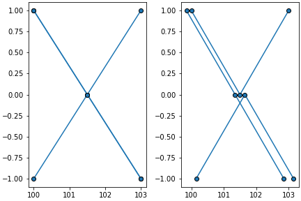
>>> array = isopy.to_refval.isotope.fraction.to_array(element_symbol='pd')
>>> isopy.tb.plot_spider(plt, array) #Will plot the fraction of each Pd isotope
>>> plt.show()

>>> subplots = isopy.tb.create_subplots(plt, [['left', 'right']])
>>> array = isopy.to_refval.isotope.fraction.to_array(element_symbol='pd').ratio('105pd')
>>> isopy.tb.plot_spider(subplots['left'], array) #The numerator mass numbers are used as x
>>> isopy.tb.plot_spider(subplots['right'], array, constants={105: 1}) #Adds a one for the denominator
>>> plt.show()

>>> subplots = isopy.tb.create_subplots(plt, [['left', 'right']], figwidth=8)
>>> values = {100: [1, 1, -1], 101.5: [0, 0, 0], 103: [-1, 1, -1]} #keys can be floats
>>> isopy.array(values)
>>> isopy.tb.plot_spider(subplots['left'], values) #Impossible to tell the rows apart
>>> isopy.tb.plot_spider(subplots['right'], values, xscatter=0.15) #Much clearer
>>> plt.show()
plot_contours
- isopy.tb.plot_contours(axes, x, y, z, zmin=None, zmax=None, levels=100, colors='jet', colorbar=None, label=False, label_levels=None, filled=True, **kwargs)[source]
Create a contour plot on axes from a data grid.
- Parameters
axes (axes, figure, plt) – Either a matplotlib axes object or a matplotlib Figure object. Objects with a gca() method that return a matplotlib axes object, such as a matplotlib pyplot instance are also accepted. If axes is a matplotlib Figure object then
plot_vcompare()will be called on every named subplot in the figure.x – A 1-dimensional array containing the x-axis values.
y – A 1-dimensional array containing the y-axis values.
z – A 2-dimensional array containing the z-axis values.
zmin – The smallest value in the colour map. Any z values smaller than this value will have the same colour as the zmin value.
zmax – The largest value in the colour map. Any z values larger than this value will have the same colour as the zmax value.
levels – The number of intervals in the colour map. Can also be a sequence of levels to be used.
colors – This can either be a list of colours or a single string of the colour map to be used. Names of avaliable colour maps can be found here <https://matplotlib.org/stable/tutorials/colors/colormaps.html#>.
colorbar (bool, axes) – If
Falseno colour bar is drawn. IfTruea colour bar is drawn on the same axes as contours. If colorbar is an axes the colourbar will be drawn on that axes. IfNoneit default toTrueif filled isTrueotherwise it isFalse.label – If
Truethen a label will be added to each label_level.label_levels – The number of intervals to be labeled. Can also be a sequence of levels to be labeled.
filled (bool) – If
Falseonly contour lines are shown. If`Truefilled contours are drawn.kwargs – Kwargs prefixed with
'label_will be sent to to theclabelfunction. See avaliable options here <https://matplotlib.org/stable/api/contour_api.html#matplotlib.contour.ContourLabeler.clabel>. All other kwargs will be send to the matplotlib functionscontourorcontourf. See avaliable options here <https://matplotlib.org/stable/api/_as_gen/matplotlib.pyplot.contour.html>.
Examples
>>> x = np.arange(10)
>>> y = np.arange(10, 101, 10)
>>> z = np.arange(100).reshape((10, 10))
>>> isopy.tb.plot_contours(plt, x, y, z)
>>> plt.show()

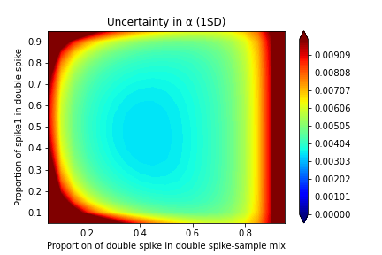
>>> element = 'fe'
>>> spike1 = isopy.array(fe54=0, fe56=0, fe57=1, fe58=0)
>>> spike2 = isopy.array(fe54=0, fe56=0, fe57=0, fe58=1)
>>> axes_labels = dict(axes_xlabel = 'Proportion of double spike in double spike-sample mix',
               axes_ylabel='Proportion of spike1 in double spike',
               axes_title = 'Uncertainty in α (1SD)')
>>> dsgrid = isopy.tb.ds_grid(element, spike1, spike2)
>>> isopy.tb.plot_contours(plt, *dsgrid.xyz(), zmin= 0, zmax=0.01, **axes_labels)
>>> plt.show()
plot_text
- isopy.tb.plot_text(axes, xpos, ypos, text, rotation=None, fontsize=None, posabs=True, **kwargs)[source]
Add text to plot.
- Parameters
axes – The axes on which the regression will we plotted. Must be a matplotlib axes object or any object with a gca() method that return a matplotlib axes object, such as a matplotlib pyplot instance.
xpos – Position of the text in the plot. If posabs is True then the text is placed at these data coordinates. If posabs is False then the text is placed at this relative position.
ypos – Position of the text in the plot. If posabs is True then the text is placed at these data coordinates. If posabs is False then the text is placed at this relative position.
text – The text to be included in the plot.
rotation – If given the text is rotated anti-clockwise by this many degrees.
fontsize – The fontsize of the text.
posabs – If True xpos and ypos represents data coordinates. If False xpos and ypos represents the relative position on the axes in the interval 0 to 1.
kwargs – Any other valid keyword argument for the
matplotlib.axes.Axes.text()method.
plot_box
- isopy.tb.plot_box(axes, x=None, y=None, color=None, autoscale=True, **style_kwargs)[source]
Plot a semi-transparent box on axes.
- Parameters
axes – The axes on which the regression will we plotted. Must be a matplotlib axes object or any object with a gca() method that return a matplotlib axes object, such as a matplotlib pyplot instance.
x – Any object that can be converted to a numpy array. If given, both x and y must contain exactly two items, the initial and the final position. If
Nonethe value if taken as the axis limit of axes.y – Any object that can be converted to a numpy array. If given, both x and y must contain exactly two items, the initial and the final position. If
Nonethe value if taken as the axis limit of axes.color –
Color of the box polygon. Accepted strings are named colour in matplotlib or a string of a hex triplet begining with “#”. See here for a list of named colours in matplotlib. If not given the next colour on the internal matplotlib colour cycle is used.
autoscale – If
Falsethe regression will not be taken into account when figure is rescaled. This if not officially supported by matplotlib and thus might not always work.style_kwargs –
Any keyword argument accepted a matplotlib polygon object. See here for a list of keyword arguments.
plot_polygon
- isopy.tb.plot_polygon(axes, x, y=None, color=None, autoscale=True, **style_kwargs)[source]
Plot a semi-transparent polygon on axes.
- Parameters
axes – The axes on which the regression will we plotted. Must be a matplotlib axes object or any object with a gca() method that return a matplotlib axes object, such as a matplotlib pyplot instance.
x – Any object that can be converted to a numpy array. Must either be a 1-dimensional array the same size as y or a 2-dimensional array with the shape (-1, 2) if y is
None. If x is a two dimensional arrayy – Any object that can be converted to a numpy array. Must be the same size as x. Can be omitted if x is a 2-dimensional array.
color –
Color of the polygon. Accepted strings are named colour in matplotlib or a string of a hex triplet begining with “#”. See here for a list of named colours in matplotlib. If not given the next colour on the internal matplotlib colour cycle is used.
autoscale – If
Falsethe regression will not be taken into account when figure is rescaled. This if not officially supported by matplotlib and thus might not always work.style_kwargs –
Any keyword argument accepted a matplotlib polygon object. See here for a list of keyword arguments.
Markers
- class isopy.tb.Markers(style=None)[source]
Rotate through the markers of the current matplotlib style.
Optionally the name of a different style can be passed when creating the object to return the colours of that style.
If a style does not have any markers defined a default list of markers is used. These are circle, square, triangle, diamond, plus, cross, pentagon.
Is a subclass of
list. Only new methods/attributes, or methods/attributes that differ from the original implementation, are shown below.Examples
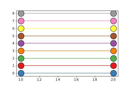
>>> markers = isopy.tb.Colors()
>>> for i in range(len(markers)):
>>>     isopy.tb.plot_scatter(plt, 1, i, marker=markers.current, markersize=20)
>>>     markers.next()
>>> plt.show()
Colors
- class isopy.tb.Colors(style=None)[source]
Rotate through the colors of the current matplotlib style.
Optionally the name of a different style can be passed when creating the object to return the colours of that style.
Is a subclass of
list. Only new methods/attributes, or methods/attributes that differ from the original implementation, are shown below.Examples
>>> colors = isopy.tb.Colors() # Colours can vary depending on the default style
>>> for i in range(len(colors)):
>>>     isopy.tb.plot_scatter(plt, 1, i, color=colors.current, markersize=20)
>>>     colors.next()
>>> plt.show()